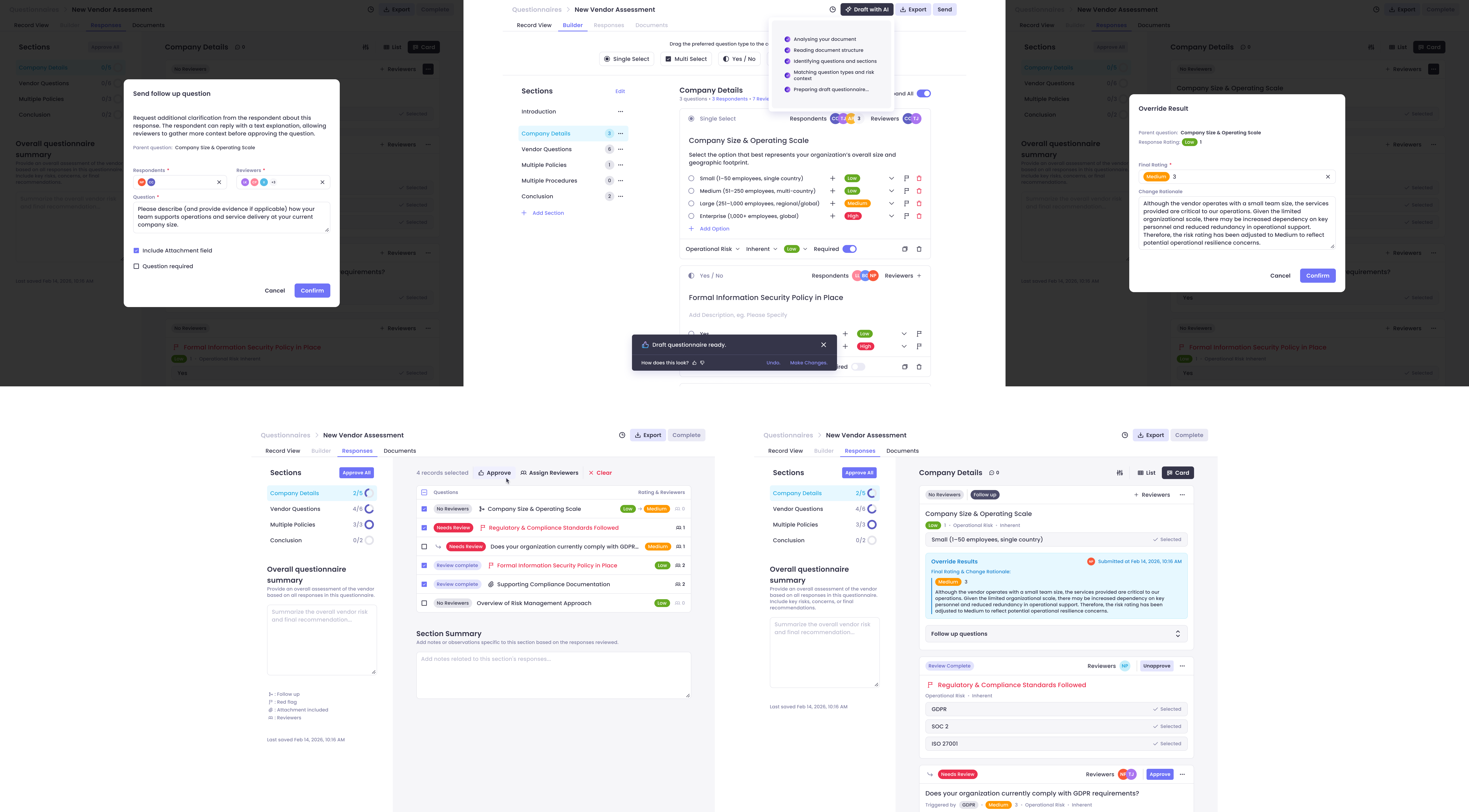
Compliance reviewer shouldn't need 15 minutes just to understand what a vendor is telling them.

But with no evidence surfacing, no contradiction detection, and no triage signal across 50+ questions, that was the reality. This project fixed it.

Case study cover 1
Case study cover 2
01 • Context & Problem

A workflow built for output, not reviewers

The platform is a GRC (Governance, Risk & Compliance) tool used by banks, fintechs, and financial institutions to manage regulatory oversight.

Its Vendor Due Diligence module allows organizations to send questionnaires, collect vendor responses and supporting evidence, evaluate risk, and approve or reject vendors. The review workflow was functional but never designed with the reviewer's workload in mind. Originally shaped by product and engineering decisions without dedicated design input, the interface was a basic table view with no intelligence, no triage, and no synthesis. Reviewers were left to make sense of everything alone, and it created three compounding friction points.

02 • My Role

Sole design lead,
expert collaboration

I led this project as the sole product designer, partnering closely with our Head of Implementation and Director of Compliance. I ran discovery, defined the design direction, and owned the end-to-end UX from early concept through handoff to engineering.

To pressure-test the work, I brought in a second designer mid-process specifically to critique the flows and surface UX issues I might have been too close to catch. Collaboration was real throughout — but design ownership was mine.

Collaborators: Head of Implementation Director of Compliance Product Designer (critique)

03 • Design Challenges

Designing AI that
earns trust

Trust in AI

Earning stakeholder trust in AI accuracy.

Early in the project, stakeholders raised legitimate concerns: how accurate would AI flagging actually be, especially for something as nuanced as detecting contradictions? To address this directly, I introduced an AI match score, a confidence indicator that shows how strongly the AI is mapping a flagged mismatch. The goal wasn't to claim 100% accuracy, but to give reviewers a meaningful signal about confidence level so they could calibrate how much weight to give each flag. This shifted the conversation from "can we trust the AI?" to "here's how to read what it's telling you", keeping human judgment at the center.

Human control

Designing for human control in a regulated environment.

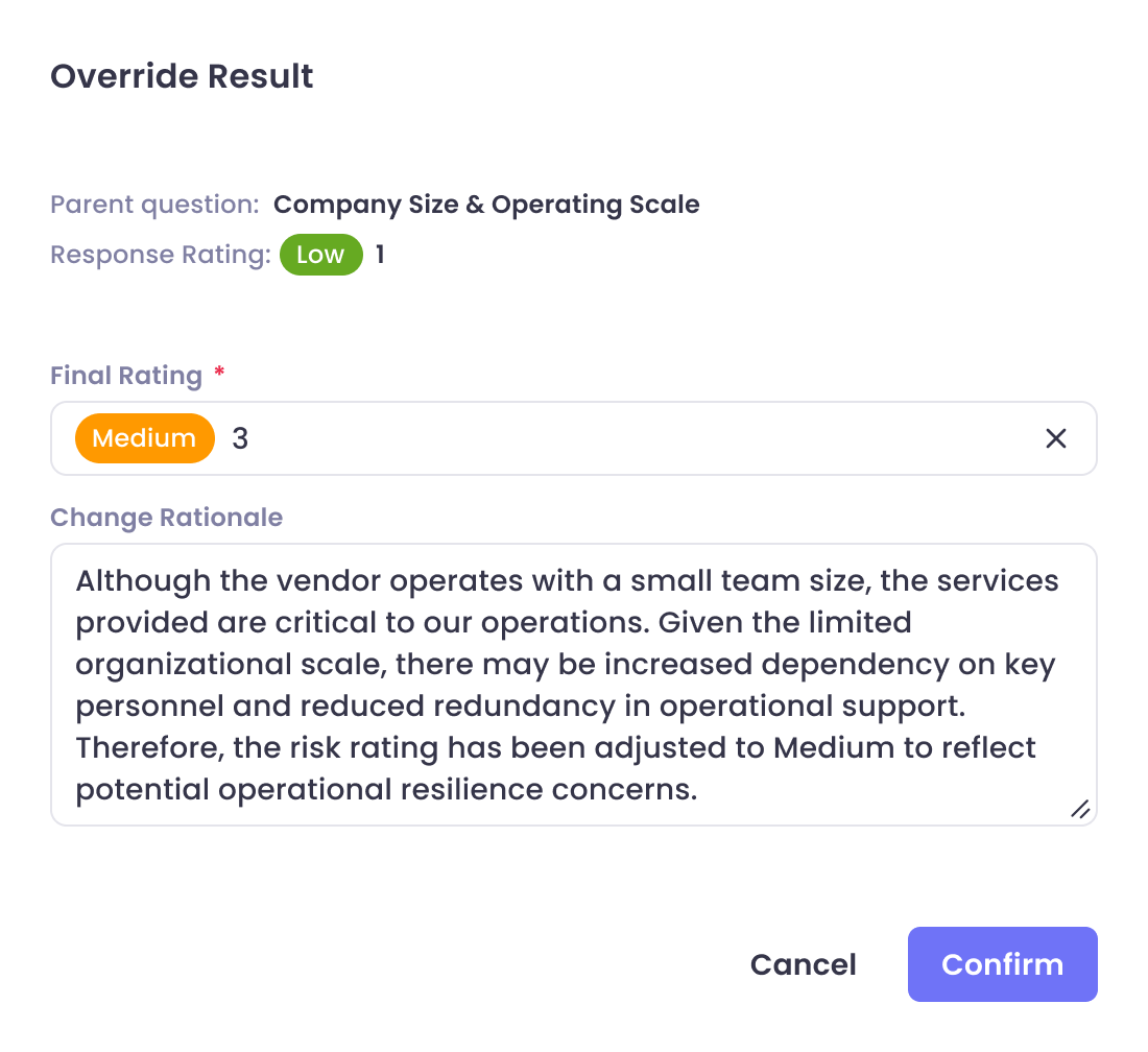
Compliance reviewers are accountable for their decisions. They can't and won't hand that accountability to a system they don't fully understand. The design had to position AI clearly as an assistant, not a decision-maker. Every insight the AI surfaces is a starting point for human review, not a conclusion. Final ratings and vendor decisions remain entirely reviewer-controlled.

Technical constraints

Technical constraints around contradiction detection.

Of all the AI features, flagging mismatches was the most complex to implement. It required training the AI to recognize what counts as a contradiction across varied language, naming conventions, and question formats. This was the most time-intensive piece for engineering, and it shaped how I designed the feature, leaning into transparency (surfacing what the AI compared, not just what it concluded) to compensate for cases where the AI's categorization might need human interpretation.

Integration

Integrating AI into a revamped module, not a legacy one.

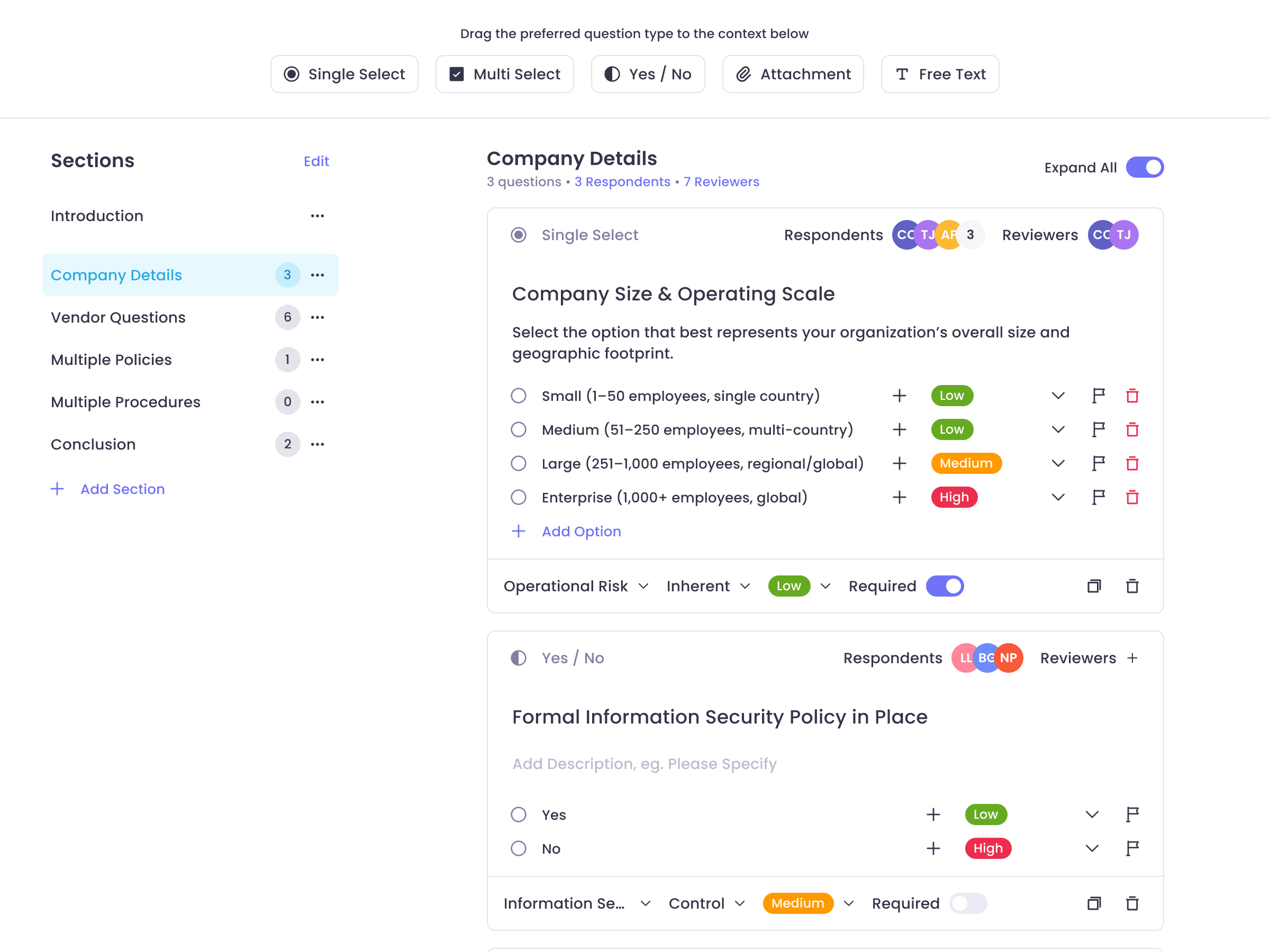
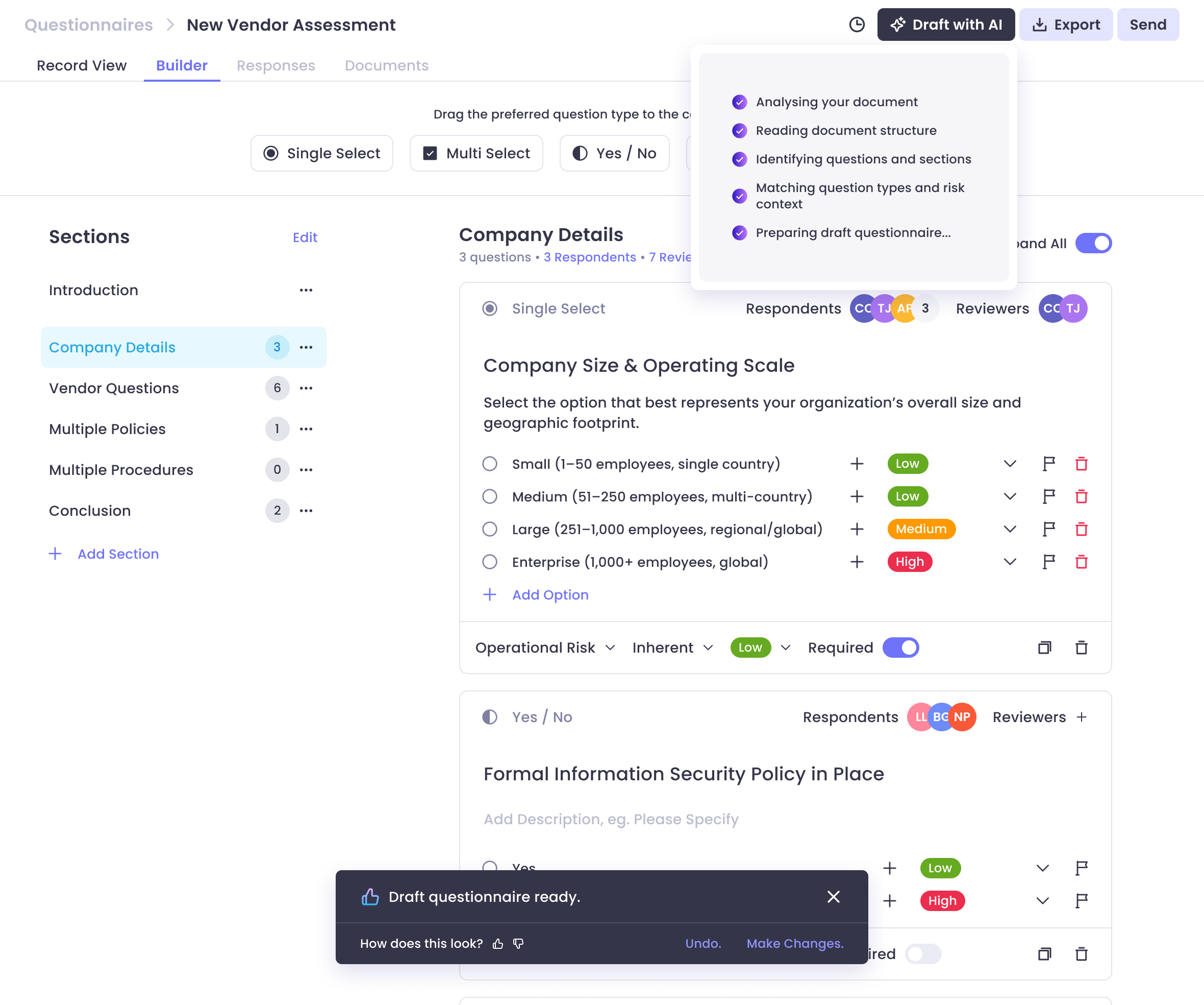
This wasn't a patch on top of an existing interface, it was a redesigned module with AI built in from the ground up. That gave us more design freedom, but also more responsibility to get the information architecture right. The challenge was making the AI layer feel native to the workflow, not bolted on.

04 • Key Decisions

Three decisions that
defined the system

Embed AI at the question level, not as a separate panel.

The decision to surface AI insights within each individual question, rather than a separate AI dashboard, was deliberate. Reviewers needed intelligence where they were already working, not a context switch to a new surface.

Questionnaires with 50+ questions per section don't benefit from a bird's-eye AI summary. They benefit from question-level triage, knowing exactly where to look and what to scrutinize.

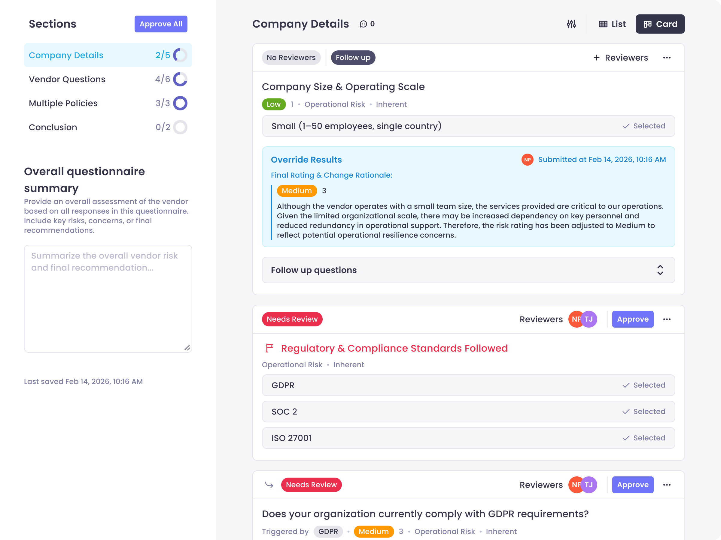
Question-level AI insights interface
Insight Type Purpose
AI Summary Concise synthesis of the vendor's response, surfacing key claims before the reviewer reads in full
Evidence Found Relevant excerpts from uploaded documents with document name and page reference
Missing Evidence Flags when a vendor's claim isn't supported by any uploaded documentation
Contradiction Flags Highlights conflicts between answers and documentation, with an AI match score indicating confidence
Suggested Follow-Ups Contextually relevant questions reviewers can send directly to vendors when a response is vague

Five structured insight types, not freeform AI output.

Rather than letting the AI generate open-ended commentary, I defined five specific insight types that map directly to what reviewers actually need. Each type has a distinct purpose and visual treatment, reviewers always know what kind of signal they're reading.

Structure over verbosity. Compliance reviewers don't need more text to read. They need the right signal, in the right place, at the right time.

Evidence transparency as a non-negotiable.

Every AI insight links back to the specific document, excerpt, and page it was drawn from. No black-box conclusions. Reviewers can verify, override, or dismiss any AI suggestion, and the interface makes that frictionless.

This wasn't just a UX preference. It was a trust requirement for the environment we were designing for. In compliance, every decision needs to be defensible, and that starts with being able to see exactly what the AI saw.

Evidence transparency interface
05 • Outcome

A process reviewers
immediately understood

AI-augmented vendor questionnaire review: final screens showing reviewer workflow and accountability.
15+ min

Baseline review time for a small questionnaire, drops noticeably with AI assistance

50+ questions

Per section on heavy questionnaires, the exact scenario where AI triage compounds most

100%

Positive reception across all prospect groups demonstrated to

06 • Reflection

What I learned about
designing for accountability

What this project reinforced about designing AI features. AI in compliance isn't about automation, it's about augmentation. The most important design decisions weren't about what the AI could do; they were about how to present what it found in a way that reviewers could trust, verify, and act on. Getting that right required as much thinking about human behavior as it did about the system's capabilities.

What I'd push further. The AI match score was a pragmatic solution to a trust problem, and it worked. But it's still a proxy for confidence, not a full explanation. Given more runway, I'd explore ways to surface why the AI flagged something, not just how confident it is. That transparency layer would make the system more useful for edge cases and more defensible in audit contexts.

What this taught me. Designing for regulated environments means designing for accountability, not just usability. Every feature decision carries weight beyond the interface, it shapes how reviewers document their work, how they explain their decisions, and ultimately how the organization manages risk. That's a responsibility worth designing to.